LifeWay.com Homepage Redesign - Case Study
A look at the process and thought behind the creation of the new LifeWay.com homepage design.
Discovery
At the beginning of 2020, we began looking at ways to improve the user experience for the homepage of LifeWay.com. Of utmost consideration in this process was our user’s experiences and the journeys they were taking to get to resources.
As we analyzed the analytics and heatmaps available, we realized that our users were definitely interested in shopping for resources by category. With this in mind, we were then able to identify the primary goals of the redesign from a user interaction perspective and an aesthetic perspective.
The Goals
To facilitate the journey for our users, we set a couple of goals in place. Primarily, we identified the need to:
- Emphasize Featured Categories
- Utilize Lifestyle Photography
- Provide Easy Access to Popular and Recommended Resources
These goals provided good guidance for us as we began to think about laying out content and user interface design.
Wireframes & Design
Once we had the goals for the project we dug into wireframes. The wireframe portion of the process is great for blocking out general content areas, and getting an idea for a flow of the page and information.
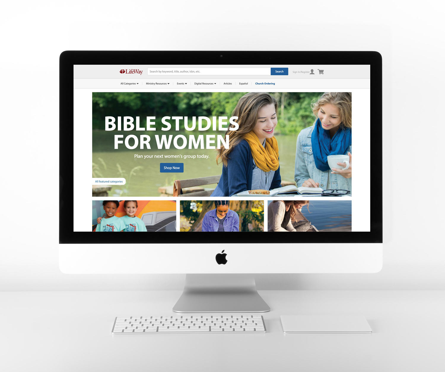
As we wireframed, we recognized that the top portion of the page is a great space to highlight a few specific categories that could be changed out by the team as needed. We decided to call out one giant hero image (I call it a jumbo hero), and below it, we landed on three promo spots to highlight featured categories. These larger image areas played nicely with the new focus on lifestyle photography, and allowed us to breathe some fresh life into the representation of the resources.
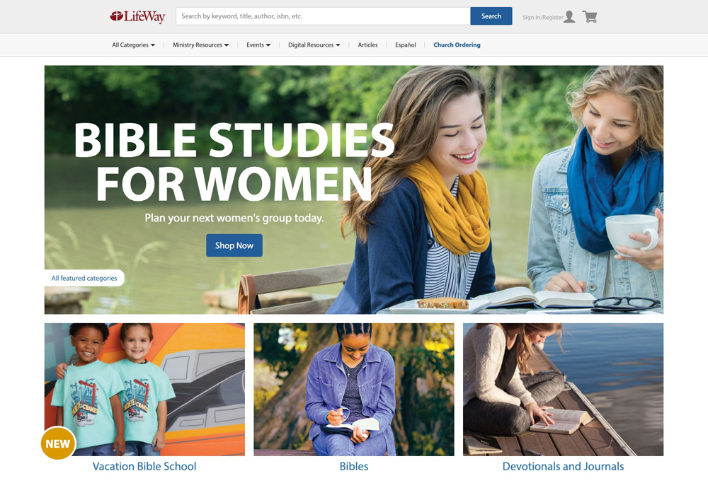
Directly below the main features of the page, we created a “Featured Categories” section. This section allowed us to showcase all of the major featured categories of Lifeway.com, and give our users quick and easy access to the various resources they may need.
The Result
In the end, we were able to launch this updated design for the Lifeway.com homepage, and it proved to be successful in helping our users reach the resources they wanted more quickly and efficiently. It’s always a good feeling when we are able to dig into the process, discover what’s needed, design an improved experience, and then launch it to positive results.