Let’s talk about Brand Redesign
A few years ago, I had the privelege of leading design during the creation and recreation of several brands at PrideSports. One of the brands I focused on is Black Widow Golf. When I arrived, the Black Widow brand was fairly well-known. Black Widow cleats were a popular choice among golf pros and in many clubhouses around the country. However, Black Widow golf cleats also resided under the more-recognizable umbrella brand of Softspikes. On packages and marketing material that existed prior to our redesign, Softspikes overshadowed Black Widow, both in recognition and prominence. This would have to change once we decided to grow the brand.
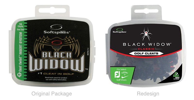
In late 2008, we began the expansion of the Black Widow brand. No longer would Black Widow hide in the shadows of Softspikes. It would now be treated as its own brand. It would have its own identity. This identity would be formed around the brand’s principles of high performance and boldness. It was time to take our first steps towards making this new identity a reality.
Create the Face
One of our first steps in the recreation of Black Widow was the creation of a new logo and logo mark. The logo of any brand is quite possibly the most crucial aspect of brand identity. Logos are the faces of brands. They are often the first thing a customer or user thinks of when they imagine company. For this reason, among others, we needed to make sure that our logo was top-notch. Successful brands are forged from solid foundations, and these foundations are built from logos that are timeless, memorable, and unique.
All right, so one of my goals was to create a timeless logo. First, I had to analyze the existing Black Widow logo. Was it timeless? Memorable? Unique? At the time, the shapes within the logo were bulky and large, and strokes and gradients were used heavily. It was not a bad logo, but the treatments dated the logo back to the early 90’s. Given that the logo could be assigned a timeframe of origination, it was not timeless. However, the logo was both memorable and unique, so my task became more clear upon further analysis. To convey the new brand identity of Black Widow, I would need to simplify the logo. Dig down to the root of the brand’s uniqueness.
Showcase the Sleekness
The individuality of the Black Widow brand stems, in part, from the fact that it is named after a sleek, lethal arachnid of the same name. Black widows make bold moves when they ensnare prey in their webs, and the webs of these spiders demonstrate admirable strength and durability. Given that two of our most important brand identifiers were the words bold and performance, it seemed pretty fitting to utilize an image of a Black Widow spider as a starting point. So, I began to search images of black widows until I found images that seemed to showcase the sleekness and power of the Black Widow.

Before too long, I had found a few images like the ones shown above. These provided a good source for me to begin making thumbnails of the logo. After a bit more work and refinement, I had narrowed down my options for the spider mark to a few rough drafts.
We were able to determine that for our spider to be bold, it could not have a flat profile. Our final spider also needed to be unique and memorable.
How to Make it Unique
Typically Black Widow spiders have an red hourglass shape on their body. This shape helps distinguish them from other spiders, and makes them very distinct in the world of arachnids. However, we want our Black Widow to be different. We want it to stand out among other Black Widow brands. To do so, we decided we’d alter the hour-glass, and utilize the shape of a golf ball on our mark. Before long, we’d narrowed down to a final design.

The beginning of a Bigger Brand
In the end, we believe the new logo mark achieved what we had hoped it would. By stripping down the design and focusing on the core principles of what we wanted the Black Widow brand to be, we were able to simplify and flatten the logo. This simplification, while still fairly new, will hopefully provide some longevity to the brand of Black Widow. In addition, we were able to distinguish the logo mark by foregoing the typical hourglass in favor of a more golf-friendly mark. We were then able to combine the mark with our new Black Widow font to finalize our Black Widow logo. The font of the new Black Widow logo was determined by an external firm, and worked well with the mark. With that being said, another intention of the new mark was for it to have the ability to stand alone as a logo mark in and of itself, and we believe it is capable of doing so. In fact, it was my pleasure to apply the mark solely in designs we created for apparel and trade show signage. Meanwhile, we proceeded to employ the new logo on packaging, advertisements, websites, flyers, booth signage and all other marketing materials. As the seasons pass, I believe that the efforts and planning we put into the creation of the Black Widow logo will stand the test of time will help to strengthen the Black Widow brand.