Less is Fantastic
A phrase that comes to mind each time I start a design is “less is more”. It’s a short phrase, a simple phrase…but it conveys a lot. I believe it was Ludwig Mies van der Rohe, a German-American architect, who adopted this phrase and applied it to minimalist architecture. From there, the phrase has been utilized and applied by architects, designers, web developers and many other types of artisans. It’s a phrase that I referenced once again as I began to develop an initial concept for my Fantasticons design.
Initial Brainstorm
Fantasticons is a design I recently created for an official Marvel contest on Threadless. Knowing this design would be for a tshirt (primarily), I started brainstorming. As a self-proclaimed comic nerd, I am proud of my familiarity with the Fantastic Four theme of this particular contest, and I began to think of different ways that the Fantastic Four could be represented on a tshirt. One of the first things that came to mind was using their “4” logo in some form or fashion. If their logo was used to represent the team out in the Marvel Universe, then why not use the logo in our universe? So, I set to work sketching up some thumbnails.
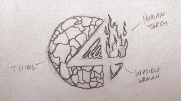
The concept hinged on taking recognizable elements from each of the four superheroes and applying them to the logo. Johnny Storm’s fire, Ben Grimm’s rocky texture, Reed’s elasticity and Sue’s invisibility were all utilized on this concept. As a thumbnail, it was starting to look nice, but something still lacked. I feared that the design might not turn out as unique as I had hoped. It was time to identify the key elements of the thumbnails that I liked and work on a new concept.
Key Elements
From my initial thumbnails, I determined that having some recognizable quality from each of the superheroes was key. Beyond that, creating a unique, effective and simple design was top of the list. As I pondered further, I began to imagine other ways that superheroes could be recognized within their own universe. Several of them already have their own logo: X-Men have the “X”, Spider-Man has the “spider”, Fantastic Four the “4”, etc. But how could the general public, in both the Marvel Universe and in reality, potentially recognize these superheroes if they weren’t present? I began thinking of symbols I see from day-to-day. Stop signs, road signs and caution signs came to mind quickly. Then it hit me..
Breakthrough
Everyday, I see the sign at work. It’s simple, it’s effective and it’s recognizable. It’s the universal male symbol used on bathroom doors, caution signs, danger signs and more.
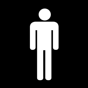
It’s the type of symbol that is instantly recognizable and universal, but so simple that it is quick and easy to digest. It was exactly what I was looking for. The concept began taking a more solid, dependable shape in my head. I would take the Fantastic Four characters, utilize the universal symbols for male and female, and manipulate the symbols to feature qualities of each of the superheroes. Commence rough sketching…
Starting to Get There
My initial rough sketches were promising, but needed some work.
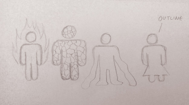
Human Torch and Thing were coming together nicely, but Mr. Fantastic’s arms were looking like wet noodles. Can’t have wet noodles on this design. Meanwhile, I contemplated the Invisible Woman. Should she be completely invisible? Should she be indicated somehow? I pondered this and continued to sketch a bit more. Now that the concept was pretty solid, I scanned my sketches and started working in Adobe Illustrator.
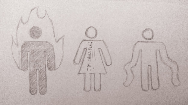
While overcoming wet noodles and invisible women, I also debated with myself over placement of the characters. Given that Mr. Fantastic is married to the Invisible Woman, I decided to try to isolate the two characters within the design, but to do so in a way that does not separate them from the team. To unify the team and to overcome the wet noodle effect, Mr. Fantastic’s elastic arms were used to encase the team and balance the design. All that was left was color.
Thinking back to the universal symbols that were the source of my inspiration, I was reminded again that less color could be more engrossing, if used in a captivating way. Many of these signs feature a black figure on a yellow or white background, providing a strong contrast that raises the figures on the foreground. Given that the Fantastic Four color is predominantly blue, I chose a navy blue as the background and a bright white to pop the figures forward. The one final touch was to make the flames an orange-red color. I debated making Thing’s icon a yellowish color but decided it would be too distracting.
And Finally, Fantasticons
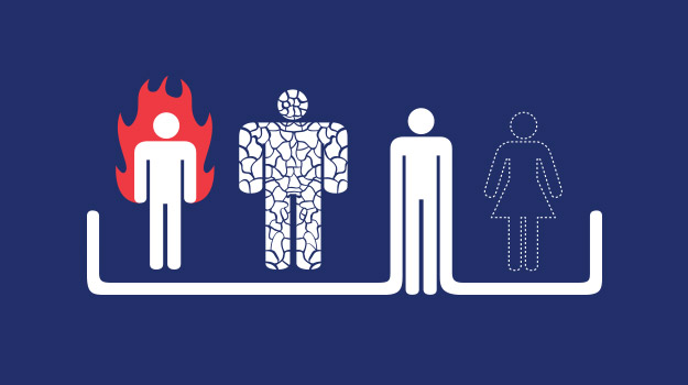
I’m happy to say that in the end, the resulting Fantasticons design provided me with the solution I was looking for. I wanted something simple, easily understood and recognizable. By using icons, the powers and abilities could be showcased on a simplistic level, while still providing a anthropomorphic quality of sorts. While there is a number of designers that are skilled at conveying messages using complex details, textures, and patterns, sometimes it’s good to just take a step back, analyze what your core idea is, and hone in on a simple, accessible concept. Less might not always be more, but when less is designed mindfully, it can be fantastic.